.jpg)
The Popcast team fine-tuned a large language model (LLM) to create bite-sized, educational, and engaging audio clips based on custom queries.
I helped them build an MVP interface to allow users to create and listen to these “popcasts”.
Product design and branding for MVP of the Popcast app
Product designer
2 developers
2 strategy & operations
1 product designer (me)
Given project constraints, I was unable to dive into in-depth customer discovery. Instead, I based the target user and their needs off market research, informal user interviews and client provided insights.
Lifelong learners curious about a wide range of topics
Podcast listeners who enjoy non-fiction content
Typically consumes content on-the-go
Values efficiency and personalization
Busy professionals and students
Ages 25-45
Uses their phone at least 3 hours a day
Listens to podcasts more than once a month
Based on the above attributes of our core users, we isolated three user needs we wanted to tackle with our app through each corresponding benefit.
User Needs
As a busy professional, I want a hands free learning experience whenever I’m on the move so I can advance in my career.
As a lifelong learner who enjoys podcasts, I want access to a wide variety of niche topics so I can satisfy my curiosity.
As a busy student, I want to listen to episodes that align with both my interests and available free time, so I can enjoy engaging content that fits my schedule.
App Benefits
We carefully evaluated what functionality would generate the highest user value after accounting for developer costs. With a tight timeline and dev constraints, I pushed forward the following client-approved features (in bold) into the next design phase.

First Session Engagement: The ratio of first sessions where at least one popcast is played to the total number of first sessions.
Overall Session Engagement: The ratio of sessions with at least one play to the total number of sessions.
Customer Retention:The percentage of users who return to the app after their first session.
Time to First Play: The average number of sessions it takes for a user to play their first popcast.
Early Engagement:The percentage of customers who play at least one popcast within their first seven days of using the app.


I explored various navigation and content organization options for the homepage. We decided to go with the 5th option of prioritizing the “create” feature with the hypothesis that encouraging users to create their own popcast will optimize early engagement.
We also kept the title “Featured Podcasts” above-the-fold to ensure users are aware of the two avenues to begin listening to their first popcast.

Initially, we selected option 4 of having a handlebar on the media player for the playback page. We felt it was clean UI-wise...

...but later realized how crucial the information we were concealing actually was.
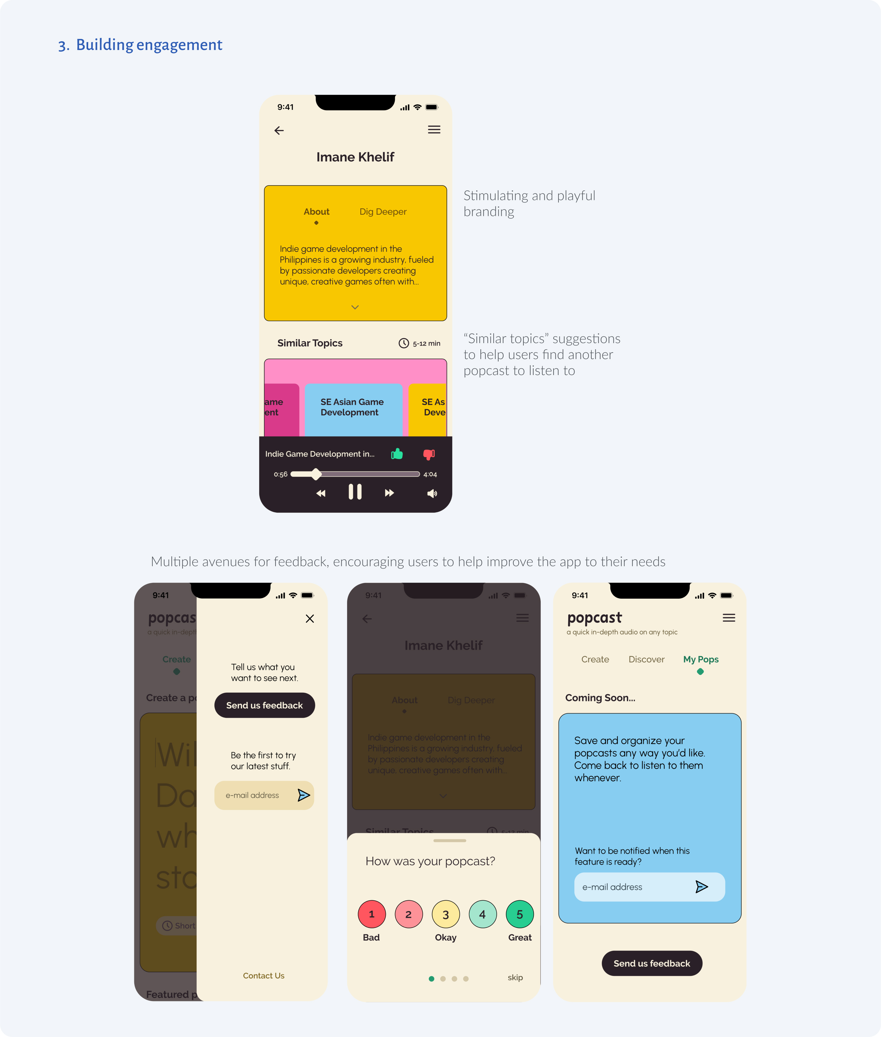
The “Similar Topics” section would directly contribute to user engagement and the sources listed in “Dig Deeper” could help users build trust with the app as a reliable, transparent source of information.
So we put these sections directly onto the playback page in mid-fidelity (below).

I also introduced a loading screen after we learned from the developers that generating a popcast could take up to 40 seconds, which was a big challenge from a design perspective.

Initially we had the loading screen display a fun fact related to the user’s query, but wondered how likely they would be to view a static loading screen for the entire 40 seconds.
We found it may be better to offer the user:
In future implementations (if latency is still high), I’d imagine this loading screen would need to be upgraded to something highly engaging such as video, animation or gaming content.

Knowing we didn’t have the time to build out every desired feature for the MVP, I turned these prospective pages into opportunities to gauge interest via newsletter signups.